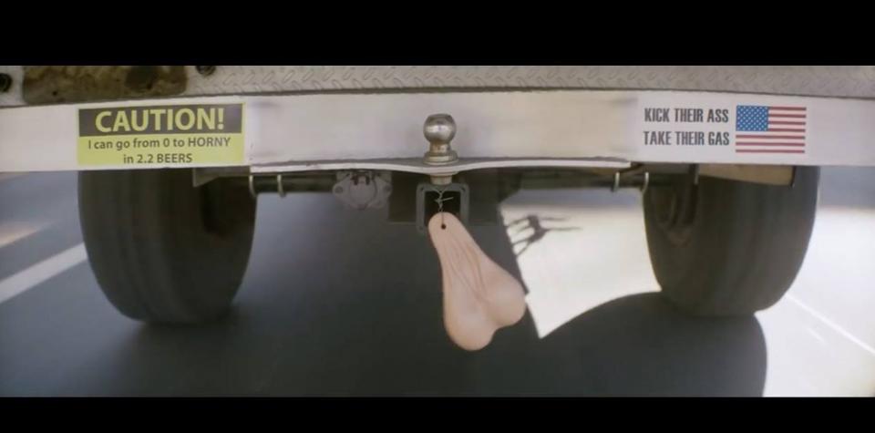
The behind the scenes story of the award winning Donate Life charity campaign – a brilliant example of creativity in healthcare.
We love a convention-busting piece of creative work here at Now Go Create, and a few month’s after the Cannes Lions International Festival of Creativity we’ve been taking a deeper dive into some of the campaigns that won big. In case you missed it, here’s a bit more info on one of the campaigns we really dig – Meet Coleman Sweeney: The World’s Biggest Asshole. Created for the charity Donate Life, the objective was to target younger people, in particular young men, to sign up for organ donation in the US. We love finding out how creative ideas get to be born and what inspires them. The creative strategy behind this ad builds on insights into the target audience and importantly, conversations with the families of people who had actually donated organs.
The Martin Agency, who were behind the campaign noted that “a typical tug at the heartstrings approach would be invisible for this target”. So they created Coleman Sweeney: The World’s Biggest Asshole. Coleman spends his days generally being as mean, nasty and oafish as possible to everyone around him. But he has one redeeming factor – Coleman signed up to be an organ donor and so thanks to him, many more people will get to live better lives when he meets his grisly end.
https://www.youtube.com/watch?v=TeVLxcekEsw
The creatives behind the campaign explain more about how they got to this provocative idea which demonstrates great creativity in healthcare and public health and awareness campaigns. In an interview with Forbes magazine they said:
Martin Agency’s Joe Alexander and Wade Alger:
Donating organs are the last thing young men are thinking about doing. They lag way behind young women checking the box. So we had to figure out a way to: 1. get their attention and 2. get them to actually sign up. At some point, we drew on stories about donor families being surprised that a family member had registered to be a donor because they were an “asshole” in life. We liked the juxtaposition of the incredible gift against the reality that in life the person could have done better, but in death, they were selfless. And boom — now we have “The World’s Biggest Asshole.”
It’s also an example of being deliberately provocative to appeal to the target audience of millennial males, with the strategy being to rely on social and earned media rather than paid. And so entertainment and shareability were key for this audience and by using dark humour and long-form content the team bucked the conventions around this kind of charity campaign. There’s often an ’emotional temperature’ around a category or a topic and for charities or public awareness campaigns it is often sadness, guilt or fear. The Coleman Sweeney campaign ignores all of those conventions because it had its core target audience in mind. As a result there were complaints about the video, but the comments and feedback were overwhelmingly positive and the results are undeniable:
- Prior to launch, Donate Life received 149 registrations per day. Two weeks post-launch, they averaged 1,040 registrations, an increase of 698%.
- The registry was 22% 20- to 34-year-olds prior to launch and saw a 236% increase. This group now comprises 52% of the total registry.
- But the most important statistic is that men 20-34 who were previously only 26% of the registry have registed and are now 56% of registrants, a 215% increase.
It’s a great example of a bold and brave creative idea that took guts to sell by the agency and courage to agree to by the charity. The work won awards for healthcare, cyber, direct and promo and activation at Cannes in 2017. It’s a bold move even in the context of other bold work at Cannes. But it’s a particularly bold move when you go and take a look at what a typical charity website looks like in terms of tone and content. Creativity in healthcare is often cited as almost impossible due to the constraints and regulations but this campaign shows that anything is possible. I tried to find reference to the viral campaign on Donate Life’s website but couldn’t find anything which I found interesting (and may just be me being dim) – but it’s a piece of work that perhaps flew under the radar of the overall charity brand in order to reach the millennial male audience. It did the job it needed to do in spades and is a testament to bravery and trust in the client / agency team.
You can read the full interview with the creatives here.
If you want to learn cutting edge creative techniques and strategies get in touch and find out more about our training programmes lucy@nowgocreate.co.uk

